
UX Case Study · 2024
Adorn
Home.
The biggest barrier to conversion isn't cost.
It's context.
Most shoppers don't need more options — they need to know which
options work with what they already have. Adorn's AI analyzes your existing
space and curates looks built around it, turning hesitation into a confident
add-to-cart.
Role
End-to-End UX Designer
Industry
E-Commerce / Home Decor
Timeline
5-Day Sprint


The Cart Was Full.
The Doubt Was Fuller.
The Purchase Never Happened.
“It looks great in the photo - but will it look right in MY living room?”
THE QUESTION THAT KILLS THE PURCHASE
The result? Abandoned Carts where confident purchases should have taken place.

01
Decision Paralysis
They love the pice but can’t commit without seeing it in their space.

02
Budget Anxiety
Every wrong purchase feels like a financial risk they can’t afford.
03
The Mismatch Fear
New Furniture has to live alongside everything they already own
PROBLEM
SOLUTION
An AI Feature Built to Turn
Doubt Into Decisions.

Reducing Purchase Indecision
Visualize new products in their space and with current items before committing to a purchase
Feel confident knowing every option fits their personal budget
Immersive experience that makes the decision feel real before the cart does
1
VISUAL CONFIDENCE REDUCES DROP-OFF & Lifts ADD-TO-CART

AI Suggestions that Know Your Taste
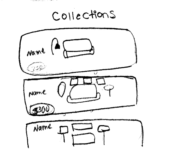
Easy Swaps: AI matched alternatives at the same price & same design concept
More of this style: AI generated concept chosen aesthetic at multiple price points
Same price, Different Look: Revisit the other styles within the same budget that were originally curated at the beginning of journey
Drives repeat engagement & brand loyalty
Creative Freedom & Instant Checkout
Easily Swap or edit any item within the concept until the space feel right
View real time price updates as you customize
One-tap checkout when room is ready, no flow interruption
shortens path to purchase & Lifts cart completion
3
2
Research
If Users Know What They Want, Why Don’t They Buy?
Uncovering how a lack of confidence and clarity stalled motivated shoppers at critical moments.

Maria
“Which products should I get if I can only afford 3 or 4?”

Ron
“Spending time searching for the right things is tiring”

Lauren
“How do I get the look I want but within my budget?”

Ally
“I like this furniture but ...Will they look good in MY living room?”

Dean
I know the “look” I want...but don’t know what products to buy to pull it off”
60%
Had a clear vision but struggled with execution
100%
Abandoned purchases due to uncertainty outweighed confidence
80%
Cited budget as a primary constraint.
CONCLUSION
While intent was high, the "Certainty Gap" was fatal. Users knew what they wanted and had the budget — but the interface failed to provide the reassurance needed to move from inspiration to investment.
Mapping the “Certainty Gap”
Uncovering how a lack of confidence and clarity stalled motivated shoppers at critical moments.
The High Point
Users arrived inspired and engaged with a vision of what they want to create
the breaking point
The moment users don't find an exact replica of an item they saw for inspiration, they immediately start to become uncertain. That uncertainty doubles the moment they have to visualize if their item looks good with the items they already own.
the result
Users’ cognitive load and disappointment lead them to retreat into the “save for Later” graveyard in order to avoid the risk of a bad purchase rather than committing to it.
Quitting
Has a hard time translating the vision into reality
Feel overwhelmed & loses motivation to continue
“I know the look I want but I don’t know the right things to buy”
“Spending time searching for the right things is tiring”
Exploring
“How do I get the look I want within my budget?”
Searches for pieces that match her inspiration board
Adds Pinterest-inspired & spontaneous finds to her cart


“... and will they Match my Couch & Lamp?”
Second-guessing her choices
Pieces feel different than what pinterest shows
Consideration
“Pieces don’t look like the one on Pinterest...”
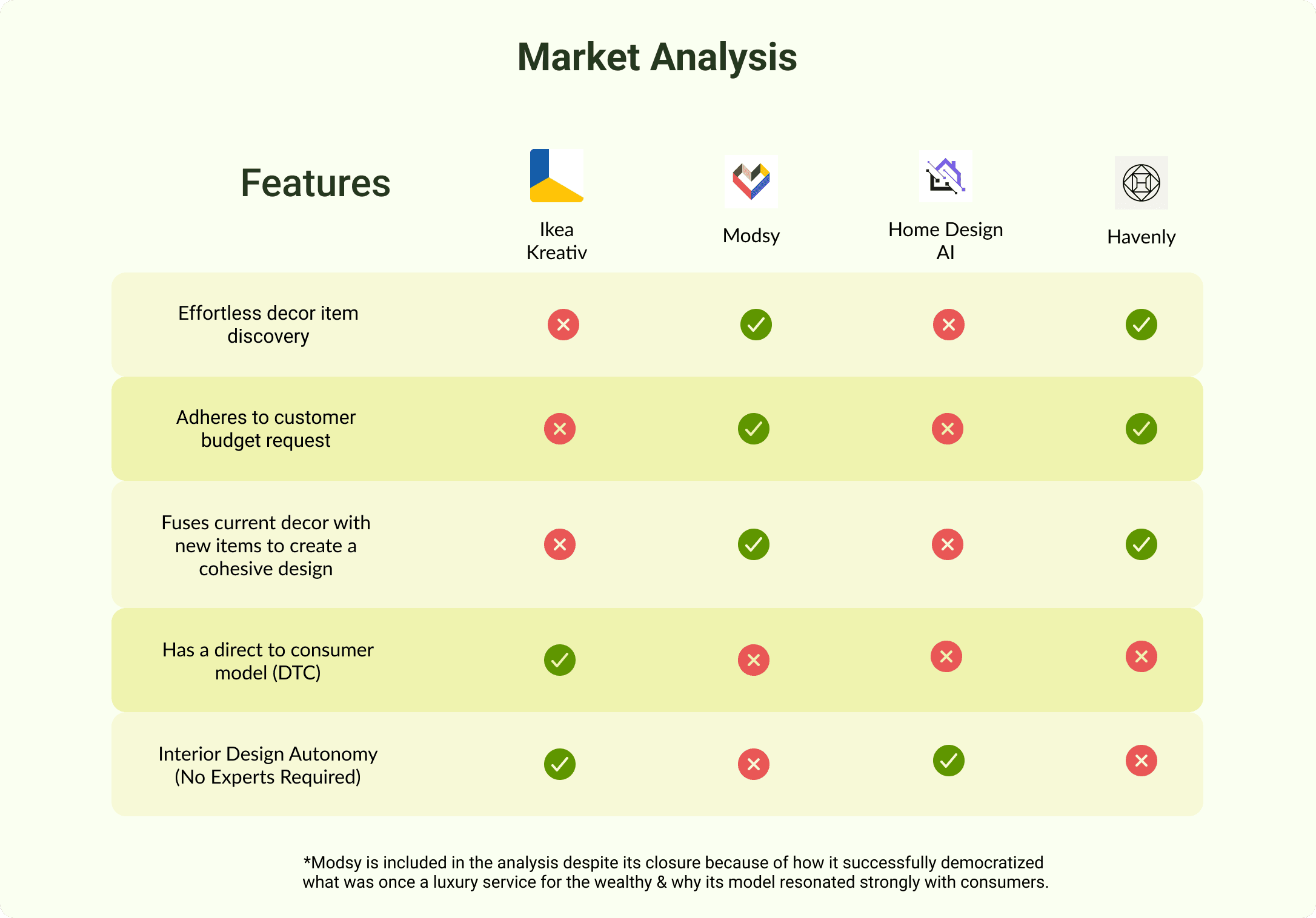
MARKETANALYSIS
The Gap No One Was Closing in Home Decor E-Commerce
Uncovering how a lack of confidence and clarity stalled motivated shoppers at critical moments.
PROBLEM
Existing solutions fail to balance affordability, design cohesion, and user autonomy, often requiring users to replace their current furniture and décor.
IMPACT
Customers are forced to rely on professionals or settle for generic results that don't reflect their personal style or identity.
OPPORTUNITY
Design a tool that empowers users to create cohesive, on-budget spaces while seamlessly integrating the pieces they
already own.
RESEARCH SYNTHESIS
The Four Design Criteria
The frustration of mismatched styles, blown budgets, and endless scrolling with nothing to show for it. Together, all four methods pointed to the same four things the feature had to get right.
Effortless Fusion
Decor concepts that match existing room style for a cohesive look
CONFIRMED BY
INTERVIEWS
JOURNEY MAP
Budget Alignment
Only show options that fit
the customer’s exact budget
CONFIRMED BY
INTERVIEWS
MARKET ANALYSIS
Design Freedom
Personalize decor concepts by swapping items without browsing endlessly
CONFIRMED BY
INTERVIEWS
JOURNEY MAP
Instant Checkout
Purchase entire curated concept with a single click
CONFIRMED BY
INTERVIEWS
PERSONAS
The Style Quiz wasn't a bad idea — it's intuitive, familiar, and would have been easy to build. But familiar isn't the same as right. When I mapped it against the research, it created the exact problem users described in interviews: too many steps before they see anything worth engaging with. A quiz asks users to articulate preferences they may not have words for yet. The AI Concept Experience flips that — it shows first, asks second, and lets the visual do the heavy lifting.
MY REASONING
MARKETANALYSIS
Choosing the Flow that Closed The Certainty Gap
Two user flows were put head to head. The choice wasn't obvious at first , until it was tested against the research.
NOT CHOSEN
Style Quiz Approach
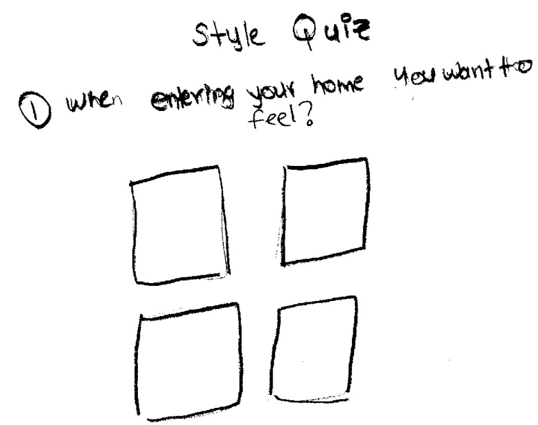
Too many prompts before user sees any product (friction before value)
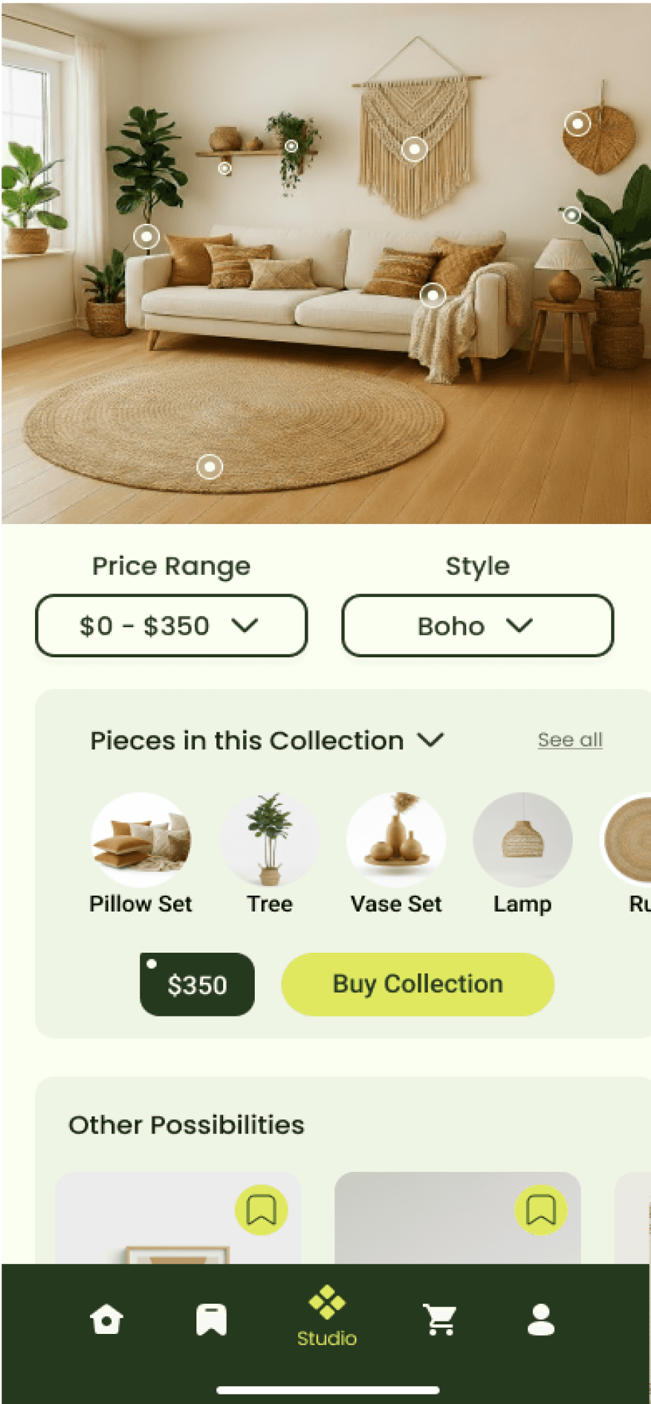
Decor concepts in list format would create decision paralysis instead of resolving it
Thumbnails too small to provide the visual confidence needed to buy
FAILS: DESIGN FREEDOM & EFFORTLESS FUSION
CHOSEN
AI Concept Experience
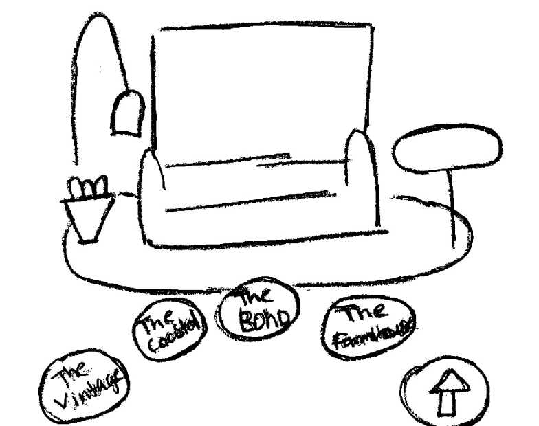
Delivers visual results immediately would lower certainty gap and boost confidence
Immersive, interactive interface that would mirror how people shop
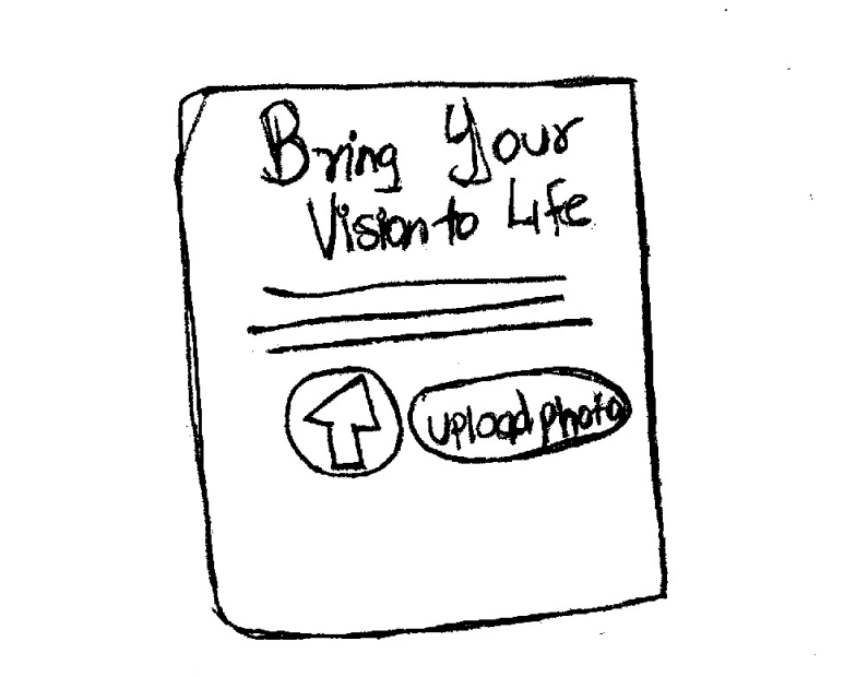
Option to upload inspiration image for AI to generate a matching concept
SERVES: ALL 4 RESEARCH PRINCIPLES
USABILITY TESTING & ITERATION
Turning user friction
into design decisions
5 moderated sessions across 2 rounds. Each change below traces directly to
a participant behavior or quote — nothing was changed on instinct alone.
1
Reduce Cognitive Load at Entry
⚠ What i observed
4 of 5 users arrived confident but left doubting:
"Other Possibilities," competing CTAs, and tiny thumbnails pulled them into a browsing loop that stalled what should have been a clear decision.
before


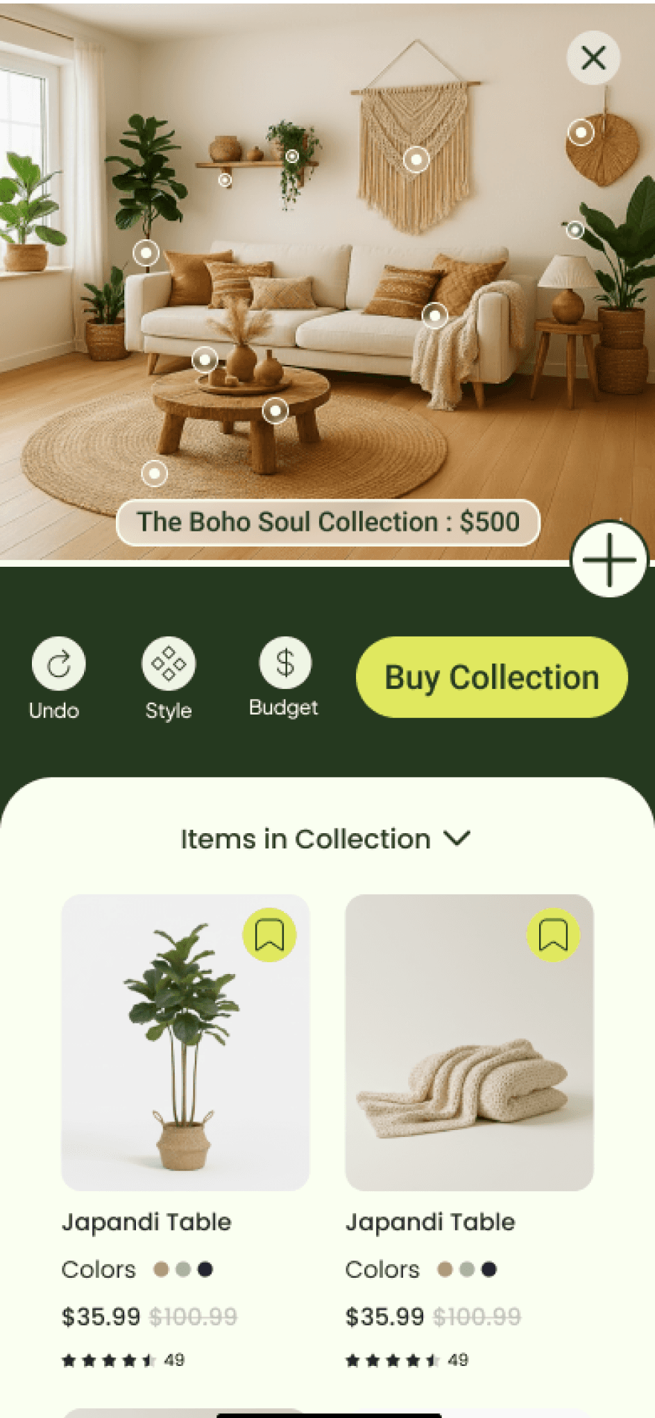
One primary CTA & streamlined buttons eliminates competing actions, giving users a clear and immediate next step.
↓ Hesitation
↑ Task Confidence
Expandable tabs surface detail only when needed. Reducing visual noice at entry without hiding useful content.
↓ Cognitive Load
↑ Decision Confidence
Hidden nav on entry for a more immersive, spacious experience
↑ Visual Focus
After


2
Make the System's State Unmistakable
⚠ What i observed
5 of 5 users paused 5+ sec on entry unable to tell if they’d entered Swap mode or were still on the home screen, which indicated that the full browse view broke task continuity.
before


A dedicated swap modal + a vertical product list making options easier to scan and compare. A distinct "Swap" header and selection checkmark keep users oriented throughout.
↓ Decision Fatigue
↑ Product Exposure
After

3
Make the System's State Unmistakable
⚠ What i observed
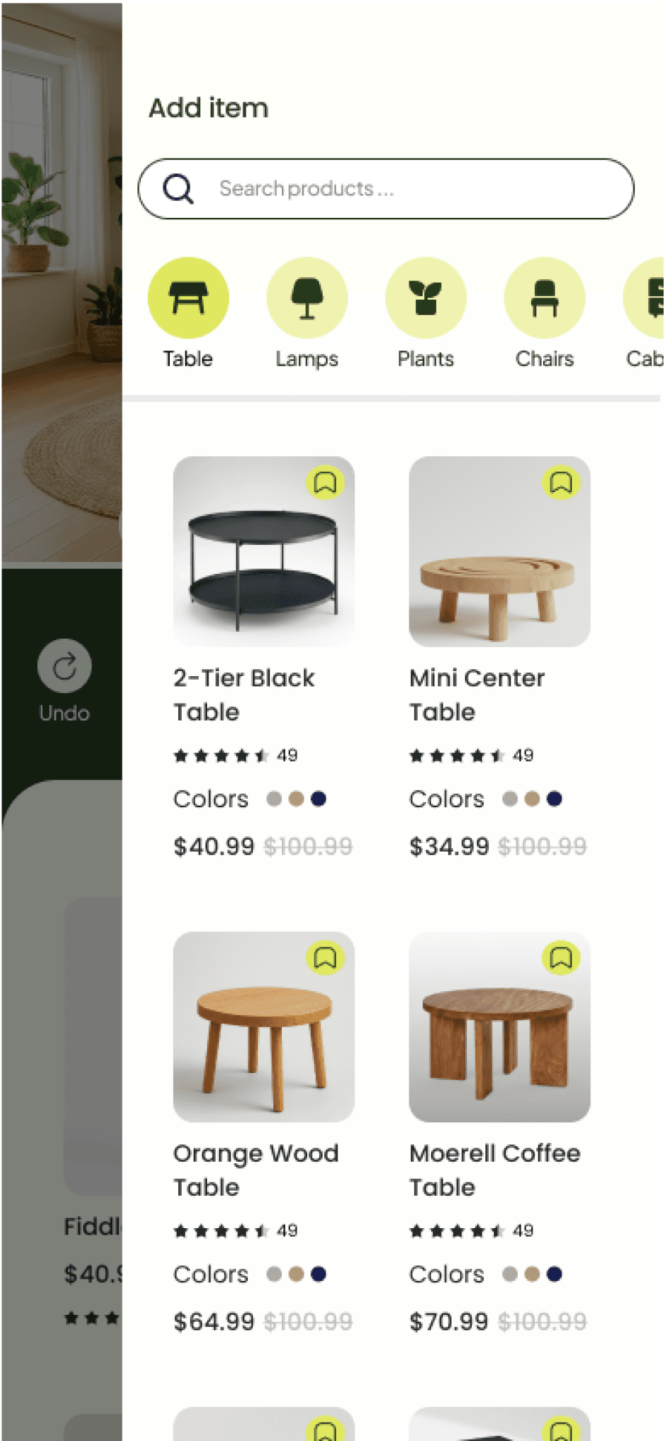
3 of 5 users felt stuck when they couldn't add an item outside the original design. With no clear path forward, it became a critical drop-off point.
A "+" button opens a searchable, categorized product browser, turning a dead end into a discovery moment. Paired with Undo, users can explore freely knowing they can always return to their original design.
↑ Product Discovery
↓ Product Exposure
before
After
After

Introspections
Key Outcomes
Captured a new market segment
by solving critical pain points (frustration, inaccessibility and barriers of entry) that had long prevented users from confidently decorating their spaces.
Lower Cart Abandonment
AI-curated designs streamline the journey from inspiration to checkout reducing time-to-purchase to under 5 minutes thus reducing cart abandonment
Customer Retention
By designing a feature that removed a customers financial and creative barriers helped users feel empowered to create cohesive spaces across their homes — driving stronger brand loyalty and repeat engagement as customers return to design beyond a single room.
Future Directions
Central hub for users’ designed rooms
Design an interface that appears before capturing a room photo, providing a hub for all created and designed rooms so users can easily return to their ongoing projects.
Information Architecture Enhancement
The “Add an Item” interface requires a more organized product list. For example, when a customer searches for lamps, a subcategory menu should be provided to help them navigate and find specific types more efficiently.
AI Design Assistant
A feature where users instruct AI to modify a generated design without having to search for products themselves and personalizing with more ease.
Lessons Learned
Modular Feature Architecture
I learned that a new feature in an app interface doesn’t have to fall with in the confines of the preexisting app. Instead users can be redirected into an entire novel set of interfaces designed exclusively for the new feature. Similar to how webpages redirections work.
Mobile Menu Navigation Designs
Working with the constraint of a fixed image occupying a large portion of the screen, I gained extensive knowledge in mobile menu navigation designs (drawer, FAB, Rudder, Sheet). Making me discover how well-designed menus can make interactions feel natural, intuitive, and fluid instead of clunky or obstructive.
AI Driven Product Discovery
Integration with AI can exponentially increase bundling of companies different products, including placing emphasis on often overlooked products that would typically escape users attention.